Home
Blog
Feminism
Art
Making
Photography
LRP
Freelancing
Studying
Funding my PhD
Rants
Starting a Handmade Business
About Me
Explore
art history
Art
•
Feminism
•
Photography
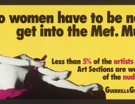
Wikipedia hack-a-thon : Non-male Photographers
Studying
Osborne’s Nursing Cuts (OR: I already know y’all hate my career choice)
Art
•
Feminism
•
Studying
Is Feminist Methodology still relevant in History of Art today?
Art
•
LRP
•
Making
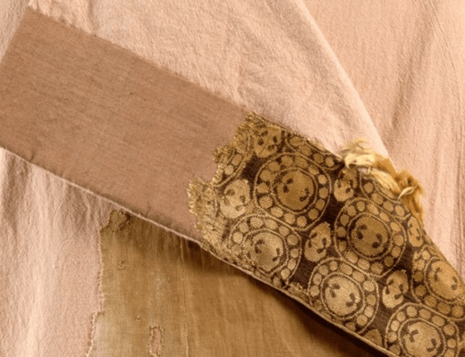
The Moshchevaya Balka Kaftan
Feminism
•
Studying
Why am I a feminist art historian?
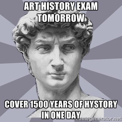
Studying
Paperless Studying
Art
•
LRP
•
Making
Mythlore Costume – Using Blue in LRP costumes
Art
•
Feminism
•
Studying
Female Agency in Art
Art
Revisionist/Feminist Art History
Art
British Museum – Pompeii and Herculaneum
Older Posts