Home
Blog
Feminism
Art
Making
Photography
LRP
Freelancing
Studying
Funding my PhD
Rants
Starting a Handmade Business
About Me
Explore
Art
Art
•
Photography
•
Studying
Paris: Day 2
Art
•
Studying
Talking about videogames
Art
•
LRP
•
Making
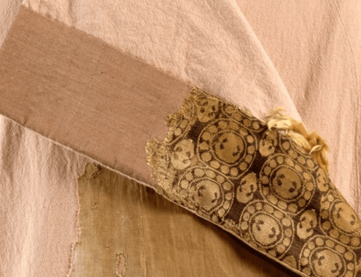
The Moshchevaya Balka Kaftan
Art
•
Studying
Proposing to study video games
Art
•
Studying
What are art museums for today?
Art
•
LRP
•
Making
Mythlore Costume – Using Blue in LRP costumes
Art
A Time to Dance
Art
•
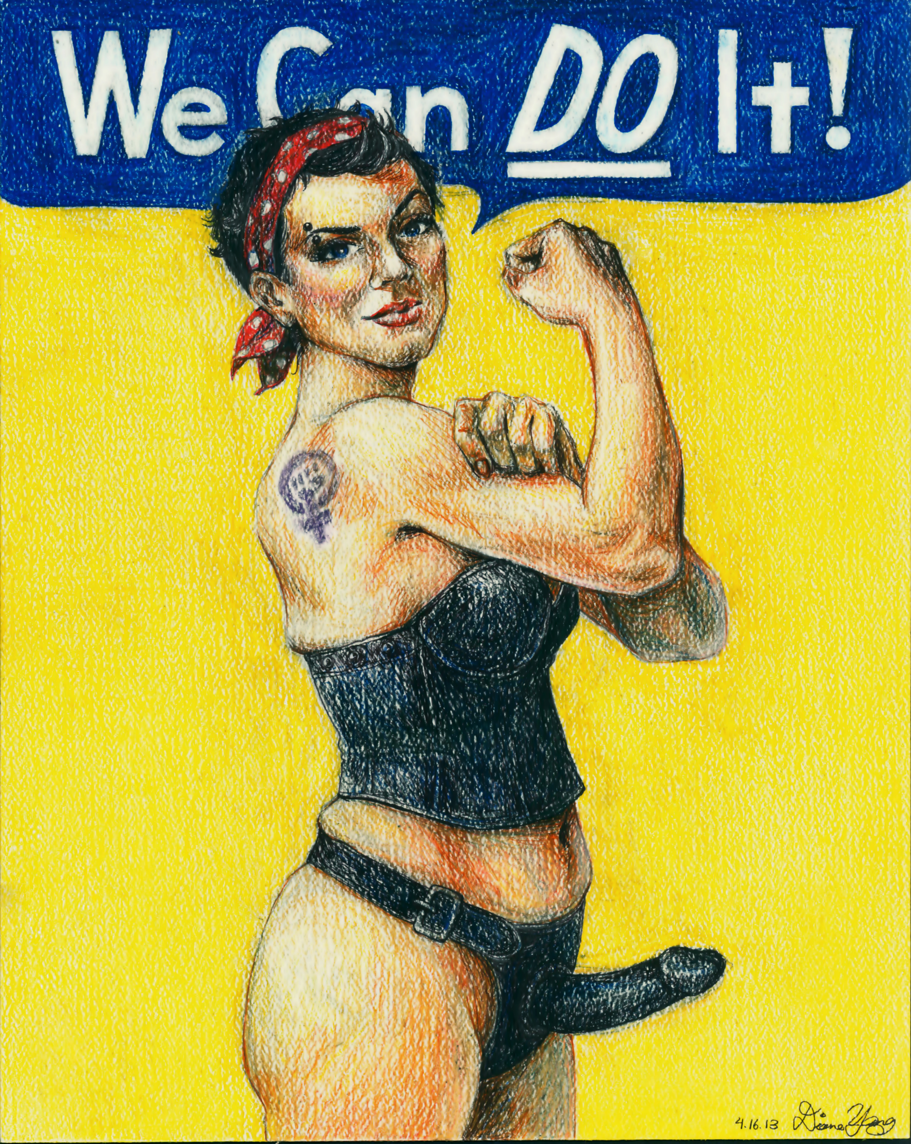
Feminism
•
Studying
Female Agency in Art
Art
•
Photography
•
Rants
Why your pictures of naked chicks aren’t art
Art
•
Photography
•
Studying
ISM – Self portraits musing
Older Posts
Newer Posts