OR: I TAKE MY LRP PHOTOGRAPHY SERIOUZ LIKE
So there’s a really interesting scene in the second Hunger Games film where Katniss goes up in the tube into the area and the aspect ratio of the film changes. The first half of the film is shot on a lower quality (read: the usual type that they use for making movies) camera which gives the film a distinctive ‘Hollywood’ look. Hollywood films aren’t actually that high quality, believe it or now.
However as she rises into the arena they switch to true IMAX format which has not only a different aspect ratio but also a very visceral quality change. It subconsciously feels like all your senses are heightened as the film makes the switch to the much higher quality IMAX format and you also feel like you’re seeing more of the world as the format opens up out of letterbox to it’s 1.43:1 ratio.
The whole arena half of the movie is shot in this IMAX format, creating tension and drama. What’s this got to do with anything? Well, mostly I just like the Hunger Games (you might have guessed from my previous posts.)
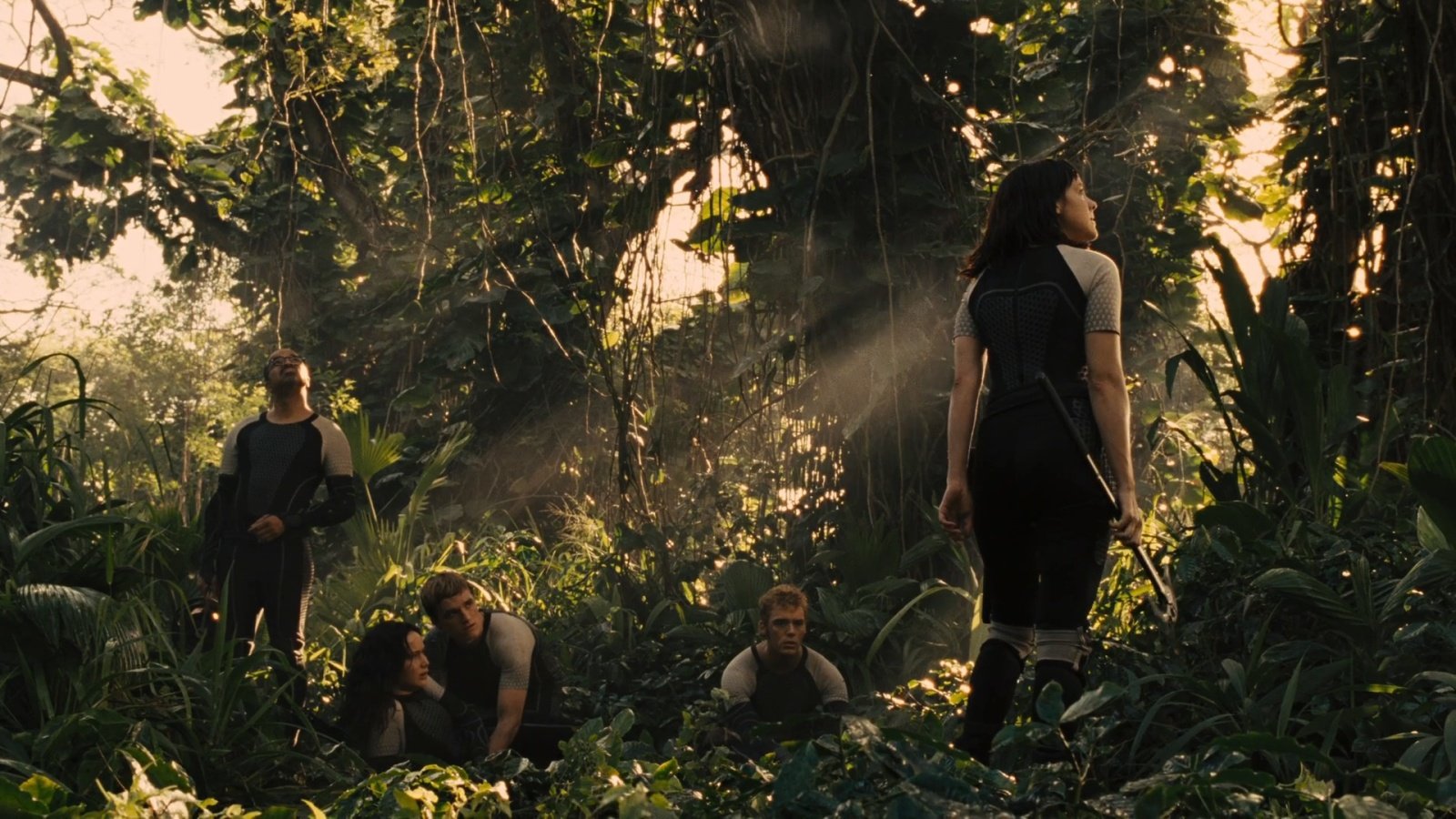
The arena has a specific look to it. It’s warm because the film makers are telling you it’s in the rainforest. They want it to to look hot and muggy. The greens are vibrant but the shadows are dirty when you look at them. However look at an image from the districts:
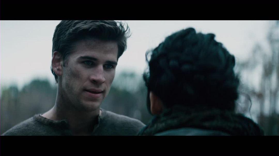 Before the arena almost everything is cold. The districts are always cold. They have those greenish shadows and blue highlights. It is winter during this period in the film, but the districts are always cold and relentless.
These things aren’t a coincidence, you can generally assume that every aspect of a well made, big budget movie was not left to chance.
You can see the same things at play in the Grindhouse movies.
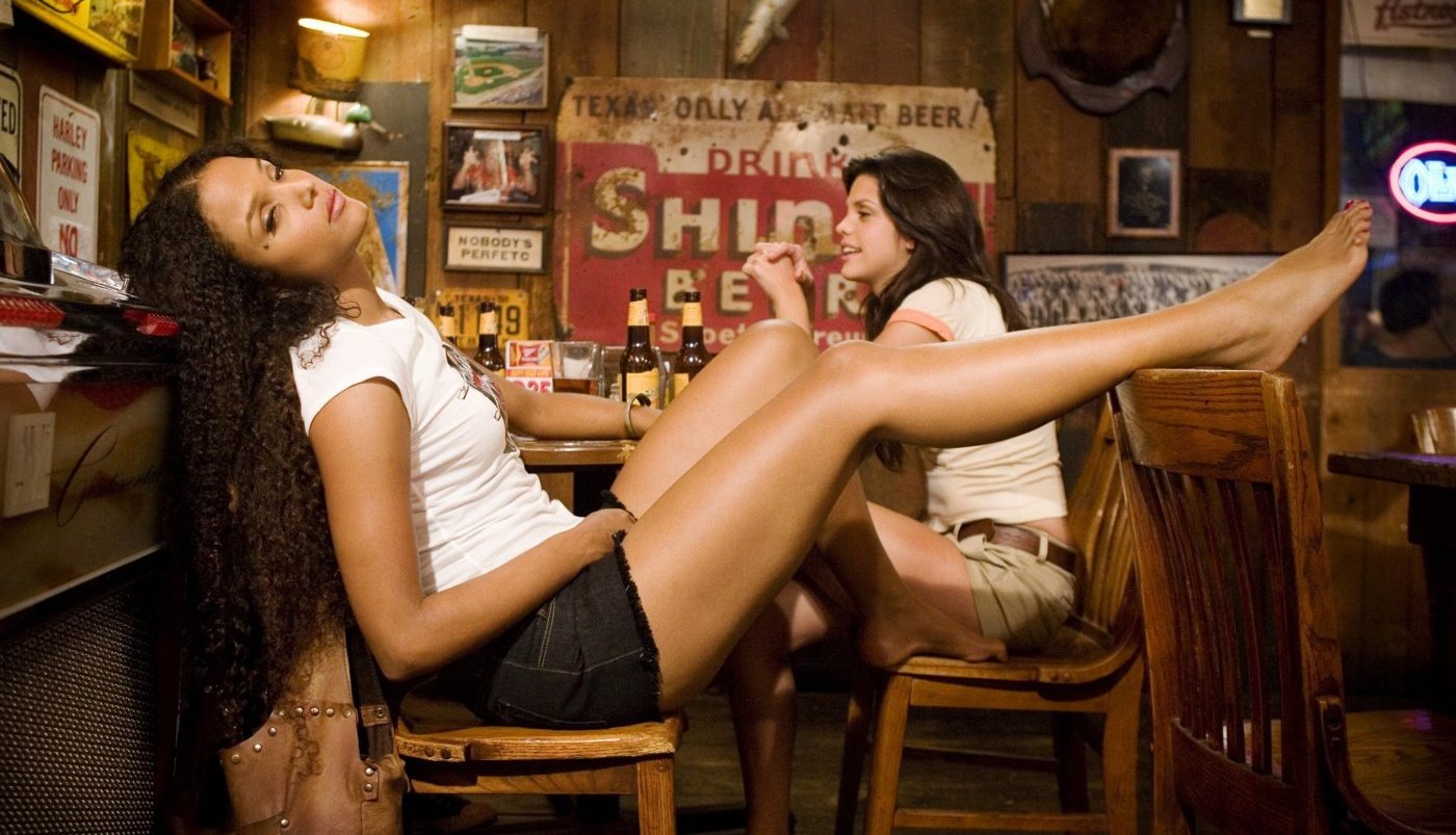
Tarrantino’s Death Proof is warm.
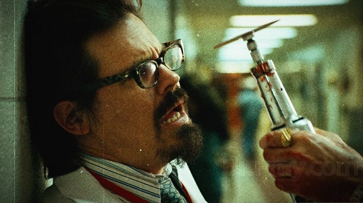
 Whereas Rodriguez’s Planet Terror is very blue most of the way through (with a couple of exceptions). You’ll also notice that it’s grainy in the image. What I can’t show you here in images is that he also plays with things like the timing of the film, so he de-syncs the visuals and the audio and he makes the video jump around like an extremely poorly made and edited film. This film is not poorly made and edited.
 So what am I getting at here.
I guess what I’m getting at is that to me, LRP photography isn’t just about taking snaps of people pretending to be other people. I’ve briefly mentioned before that I’m interested in raising the game for LRP photography and I think that digital photography has an awful lot to answer for with respect to many of thing things I consider sins.
It’s all too easy just to snap away at events and not post-process the images because you’re convincing yourself that you’re being ‘true’ to the original scene, but this is a huge departure to what photographers have done in the past. If you look through the archives of agencies like Magnum Photos or at specific photojournalists like Tim Hetherington or Don McCullin you’ll see that they have a ‘look’ to their images. While much of the ‘look’ of a photographers work is determined by things such as lens choices, compositional devices and similar it’s also determined by the way that you grade your images.
In the past colour (or black and white) was dealt with by photojournalists before they picked up their cameras. Film selection is crucial to the look of the finished photograph – two black and white films can look vastly different even when shot by the same photographer, for example. You can also change things afterwards when you develop the film and print the photos, but overwhelmingly the look will be determined by the film that you choose to put in your camera.
Digital has made us lazy. We can choose how our images look after we have taken them. We don’t have to commit to a certain look before we take a picture. However as a result it seems that most photographers just make their images look ‘true to life’, which is great if you’re a commercial product photographer trying to accurately represent a set of towels for John Lewis, but a bit boring if you’re trying to capture the feeling of a place.
It’s also really interesting that last year I interviewed a photographer who was giving a lecture. I asked her how she sold images to a public who all owned digital cameras, she said that she gave them something that they didn’t know how to do. One of her biggest sales tactics was to produce work that is colour graded. She pointed out that most people who aren’t into photography won’t understand what you’ve done to the image, only that you’ve done something to it that they can’t do themselves. It’s the same when you consider Hollywood – my home videos don’t look anything like big budget production, or even low budget production. At least in part it’s because I don’t really know much about colour grading videos.
After I’d attended a couple of Empire and an Odyssey, I decided that actually my photographs didn’t show the world how I experienced it. My first photographs were pretty pristine and accurate. I mean that’s a good thing to be able to achieve, but they were boring. I’m going to illustrate this point with a photograph of Andy because he knows that I don’t think he’s boring (far from it), it’s just my picture here that is boring:
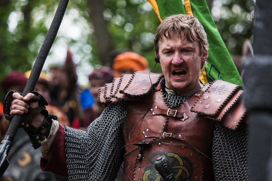 The photo is fine. There’s nothing wrong with it and it ticks lots of ‘good photo’ boxes. It has a nice out of focus background, it’s got pretty good composition, the subject is in focus and doing something interesting and the colour is good. But it’s boring.
So when I realised I was producing boring photographs I went away and thought about why I was missing the mark. And the fact is that Anvil isn’t this pristine, colourful place. Anvil to me is slightly dark and muddy in feeling (and in person, but lets not talk about the mud). It’s a bit oppressive too. This is a place of struggle where the hero’s of the empire are trudging out into far away lands to fight an oppressive enemy force. Lines from Wilfred Owen run through my head when I think about Anvil .
Bent double, like old beggars under sacks,
Knock-kneed, coughing like hags, we cursed through sludge,
Till on the haunting flares we turned our backs
And towards our distant rest began to trudge.
Men marched asleep. Many had lost their boots
But limped on, blood-shod. All went lame; all blind;
Drunk with fatigue; deaf even to the hoots
Of tired, outstripped Five-Nines that dropped behind.
Anvil doesn’t feel to me like it’s a nice place to be. It might technically be safe, but we’re getting on with the business of war fundamentally. My pictures didn’t convey that feeling, my pictures made it feel like we were all out on a Sunday jaunt to fuck up a few Orcs. I had to change something. My interest is in narrative and the human condition, if I’m not conveying that in my photographs then I’m not doing it right.
I’d also set out with a goal to shoot ‘something cinematic’ right back before the first event. All I understood about LRP was that it was a bit like a movie that would unfold around you, if you’re a bystander. Sounded great. But my pictures were also not ticking any of the cinematic boxes.
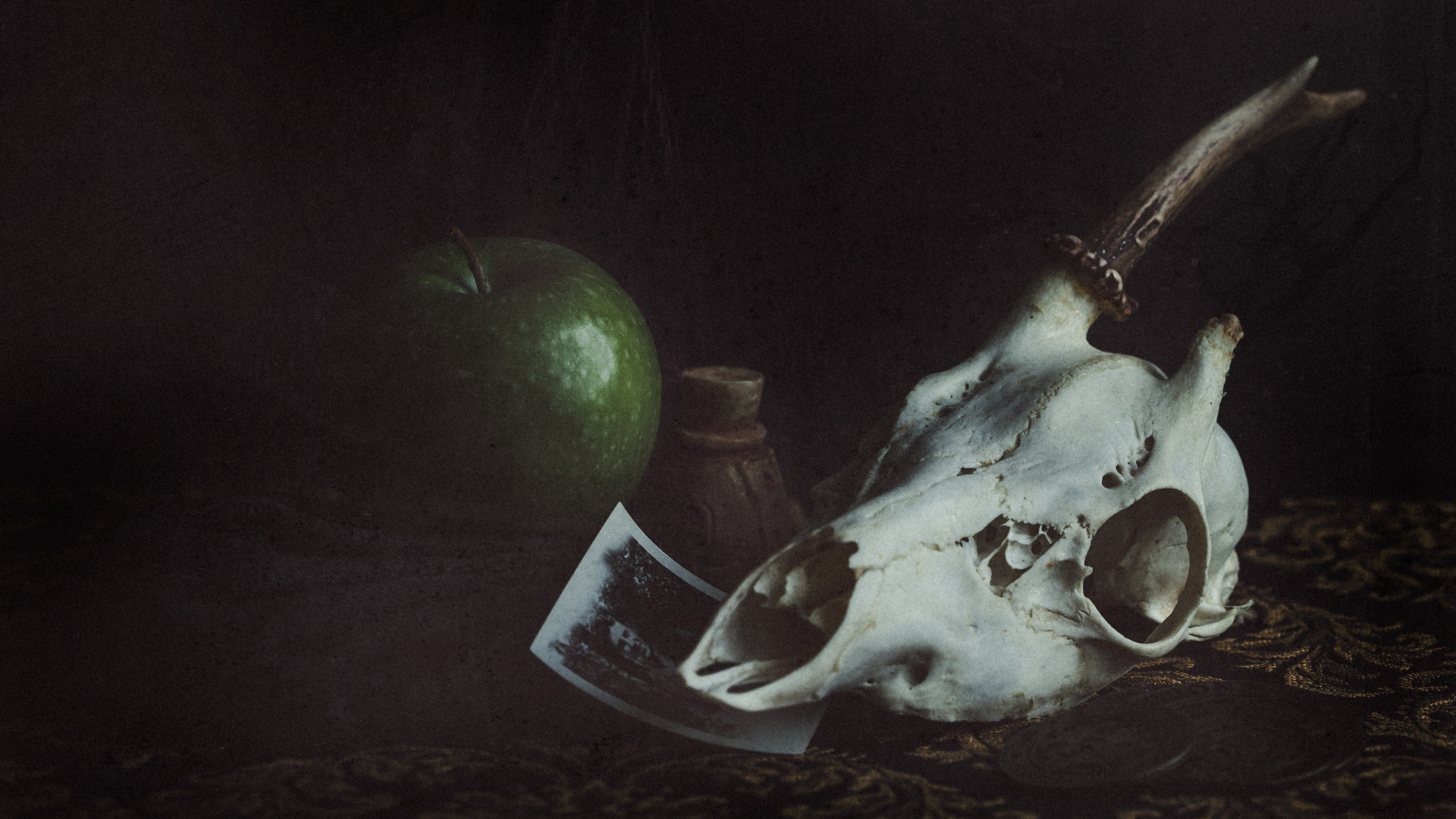
So I spent time developing a processing recipe that I felt accurately portrayed the way that I saw the world that I was photographing. The result was dusty blacks and a dark, green tinge to all the photographs. The dustiness of the blacks (i.e., they never really go black anywhere on the image) is like using old film after it’s expired. Something I felt appropriate to an archivist visiting this shanty town of canvas (and yes, I do see things through the eyes of my character, even if I barely play her. She’s a Highguard Archivist). I also made the decision to crop into a letterbox format with a ratio of 16:9 for all horizontal images (and I do mostly shoot horizontal images, because most monitors are horizontal).
The combination of colour grading and cropping make the above image look like this:
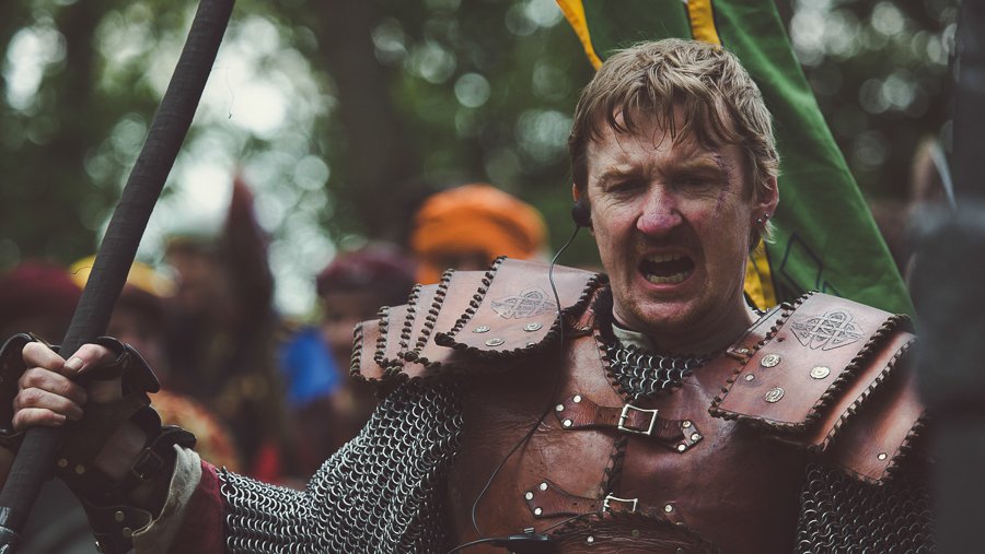 You might not like what I did, but to me it certainly feels more atmospheric and like it’s capturing the spirit of Empire.
Odyssey is different again. To me, Odyssey feels blue (yeah take the piss, I associate things with colours). And this was before I really understood that Odyssey took place on a risen Atlantis. Lets see what Odyssey looks like:
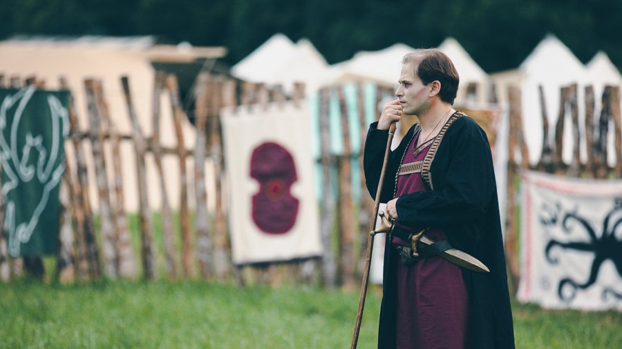 Odyssey often changes colour for me depending on the time of day too. In the evenings things often get more tense, and when that happens it sometimes becomes more blue – this is deliberate.
 I’m not saying that this is the only way to shoot LRP. Everybody has their own way of doing things and their own personal preferences as to how they look images to look. There is no wrong or right way to do this at all and I’m not going to tell you what you should like best.
However I think that when it comes to raising the standards of LRP photography it would be good if every photographer considered how the event that they’re photographing feels and if that can (or indeed should) translate into the way that images look. I appreciate that perhaps I spend more time than others thinking about these kind of things because of the nature of my job and my studies (art history student) however it would be great to encourage others into thinking about what they do too.
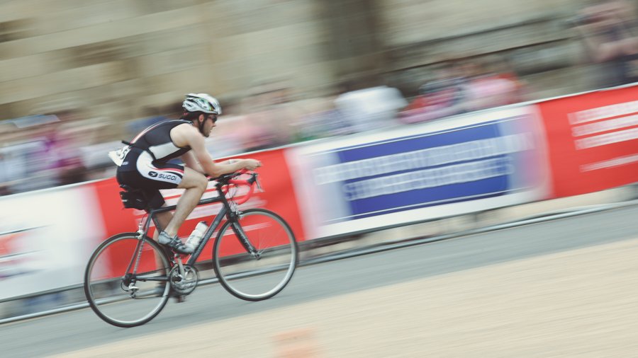
I mean aside from anything else, I like to hope that this makes my images recognisable, that I’m building up a certain style to my work. In fact I fell in love with the recipes I created that I use them in my more normal work too, because I think they’re pretty cool. Like this one here from the Blenheim Triathlon.
So I don’t know really. We might not have the glorious settings of Eastern Europe and Scandinavia for our games, but we can sure take a good picture here in the UK of our LRP. It just takes, I believe, that little bit of extra effort and a little bit of going above and beyond what others may have to do when they have beautiful settings and great immersion handed to them on a plate.
Hope this article has been interesting to people who are curious about the thought process of this photographer. Nothing here was intended to cause offence, my apologies if it did.